
What you Need to Know to Build Your Website Footer
The purpose of a website footer is to hold small chunks of key content that is commonly looked for by website visitors. Your Website Footer helps anchor your website visitors with navigation shortcuts and call outs for some key information that should always be easy to find and prominently placed. This is where commonly searched for items such as your address, phone number, and key person/department contact information should go. It is also a good place to hold social links, affiliations and membership logos and links, along with your privacy policy, and a sign-up sheet for joining your mailing list. We will also talk about use of color and text within your website footer elements and touch upon the design aspects that you should consider when creating the footer for your website. Use this checklist to put your best foot forward when creating your website footer. Generally speaking, your website footer should be treated just like your website navigation menu. This means it should be consistent on every page of your website.Your Website Footer Checklist
- Key Company Information
- List of Condensed Key Website Page Links
- Privacy Policy
- Join Our Mailing List Sign-up
- Memberships and Affiliations
- Social Media Icons and Links
- Sitemap
- Design Elements
- Other Features
With these practices in place, website visitors are more readily able to read all about your great products and services or articles and blogs and stay on your website longer! ~ Becky Bruso, The BizPal Company, LLC.
Website Footer: Company Information
Name, address, phone contact information. This is a pretty common sense element but you will find that many websites do not follow this practice. Just ask yourself how many times you have tried to find out this basic sort of information about an organization and found yourself frustrated by having to do a deep dive into that org’s website to find this information. Did you click away in frustration? This is something you want to make sure doesn’t happen on your website!Website Footer: List of Condensed Key Website Page Links
A condensed series of links to your most commonly access pages is also a good practice to include within the website footer. Keep this list limited to 3 to 5 top pages you want to feature or the 3 to 5 most accessed pages visitors go to. You want to keep the overall height of your footer area smaller in relationship to your overall website page area.Website Footer: Privacy Policy
Links to your privacy policy fits well within the footer area. Privacy policies have become increasingly important as the bodies who govern data usage on the web are introducing new laws and policies such as the 2018 European Union GDPR. You can Google Privacy Policy and GDPR and find samples of what these documents should contain and modify them to match your privacy policy practices. Every piece of content helps to create confidence in your website, your company, and its brand. Publishing your privacy policy enhances your professional business image. We consider it another must have for your website.Website Footer: Join Our Mailing List
Another common practice is to place a link to a sign up form where website visitors can join your mailing list. Keep in mind that website visitors have different entry points to your website. For this reason, it is a good idea to always have the ability to join your mailing list displayed. Join My E-Email List Placing this in the footer doesn’t mean that you can not also add the ability to sign-up to join your email list within the various posts, pages, and products or services pages of your website. It is okay for this type of information to appear more than once on your website pages. This is because you want to make the job of finding information easy for your website visitor within the context of what they are reading or viewing at any given moment.Website Footer: Memberships & Affiliations
Memberships and affiliations also fit well within the footer. A caveat on listing of memberships and affiliations in the footer should be mentioned. The purpose of a footer is to hold small blocks of content. If your organization has a list of memberships and affiliations that creates a footer area with more than 300 to 400 pixels or roughly 2.5 inches in height, your best bet would be to limit those you put into the footer or create an entirely new section on your website to house these membership and affiliations. The point is that you want to keep it brief and have it occupy a minimal amount of space.Website Footer: Social Media Icons and Links
Social Media Links that open up in a new window directly to all of your social media pages fit well within the footer area of your website. Only include those where you have a social media presence. The icon should have a link out directly to the home page of the specific social media account and it should open up in a new window or tab of the browser.
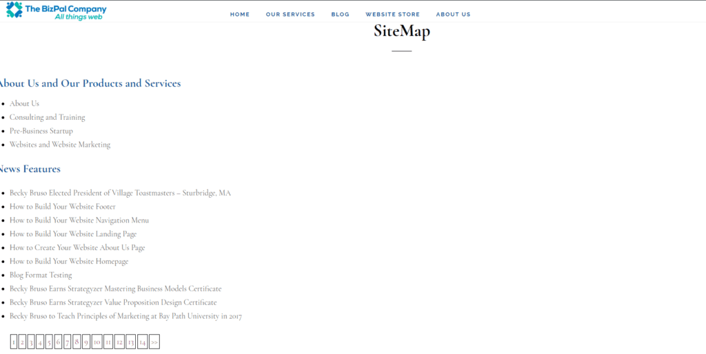
Website Footer: Sitemap
The purpose of a sitemap is to have a single page that lists all your pages for Google and other search engines to consume for indexing purposes. It will help with getting your content listed with the various search engines. There is a little more work required to fully enable this which will be covered in another article.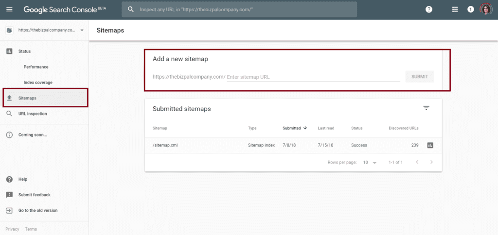 The starting point is always to get this site-map page up and running first. You can create a sitemap to submit to Google by going to the Google Search Console. Once it is created, you can upload it to your website, submit it to Google ( via the Google Search Console), then add a link in the footer to this sitemap.
Website Footer: Design Elements
Website Footer colors should follow the color pallette identified for your website. Typically, the accent color is used as the background. In some cases, the background is set to an image, or even a neutral like black or grey. The important design aspect to remember is to select a font color that is easy for your website visitors to read when placed upon your chosen background. Extremely busy or loud image backgrounds may be harder to read than those that more muted. Dark backgrounds look great with lighter contrasting text. Frequently, white or hues of white are selected as the text color on these dark backgrounds. A text color in the same tone as the background may be hard to visually distinguish the text from the background and result in poor readability. Conversely, light background footers look fabulous with dark black, dark grey, dark navy, or other dark text contrasting colors for your fonts. For example, consider what it would be like to find a background with soft sand, wood hues, or brick versus a busy loud floral or city scene background. The goal is to be sure that the text you feature on the footer background does not get lost in the background image or blend in so well that it is not readable. Consider the following images as backgrounds to understand the busy versus muted image concept we are describing. Imagine what it would be like to have the text on each of these backgrounds within a footer of your website.